
Designing Litewave AI’s First Official Website
[Project Overview]
Litewave AI is a San Francisco based startup building an AI-powered compliance and observability platform for regulated industries like pharma manufacturing.
My goal was to design and launch Litewave AI’s first official website that communicated their mission with clarity, credibility, and visual consistency. As their solo designer, I led the entire process of research, UX architecture, interface design, motion design, accessibility, and compliance integration, taking the brand from zero to launch in just six weeks.
The result was a modern, scalable, and SEO-optimized website that became the company’s primary touchpoint for investors, clients, and partners, strengthening Litewave’s brand presence and doubling demo conversions within the first month of launch. Check it out here!
Role
UX Designer
Industry
Non Profit, B2C SaaS
Time
4 months
Tools
Figma
Platform
Web App
Status
Shipped
Impact
Reduced report-writing time by up to 50%
Improved volunteer retention rate
More time for child-focused activities
[Problem Context]
When I joined Litewave AI, there was no website, just a vision. The founders needed a digital presence that clearly explained their complex AI platform in a way that felt credible, human, and enterprise-ready.
Litewave’s product ecosystem — Digitize → Comply → Optimize — is powerful but inherently complex. It combines AI, data science, and compliance automation for enterprise manufacturing clients.
The company needed a digital front door that could communicate that complexity clearly without losing depth. They wanted something that -
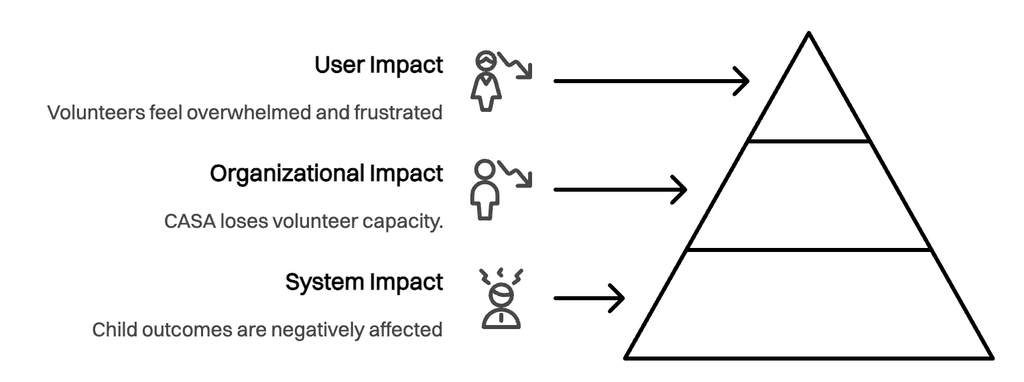
25%
Volunteer Turnover Rate
One in four volunteers leave within the first year, with administrative burden cited as a leading contributor to burnout and disengagement.
120 hours
Lost in administrative tasks
CASA volunteers spend nearly half of their time on court reports and documentation instead of directly supporting children in foster care.
40%
Reduced child interaction time
Volunteers report spending 40% less time in meaningful, in-person advocacy with children than they would prefer due to documentation demands.
[Solution Summary]
I started with asking one question:
"If Litewave were a person, how would they introduce themselves online?"
From there I followed a four-phase design process, which resulted in a five-page responsive website with
Home,
Platform,
Pricing,
About,
Contact,
legal/compliance pages
The tone was clear, confident, and quietly bold. The experience was fast, structured, and trustworthy.
50%
Reduction in report writing time
AI-assisted drafting and smart templates cut paperwork effort in half, giving volunteers more time with children.
25%
Decrease in volunteer turnover
Streamlined workflows help reduce burnout, improving volunteer retention and long-term engagement.
2x
Increase in child interaction time
Volunteers can double their face-to-face time with children by minimizing administrative load.
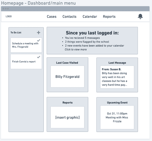
DashBoard
Report writiing
Note Assist AI
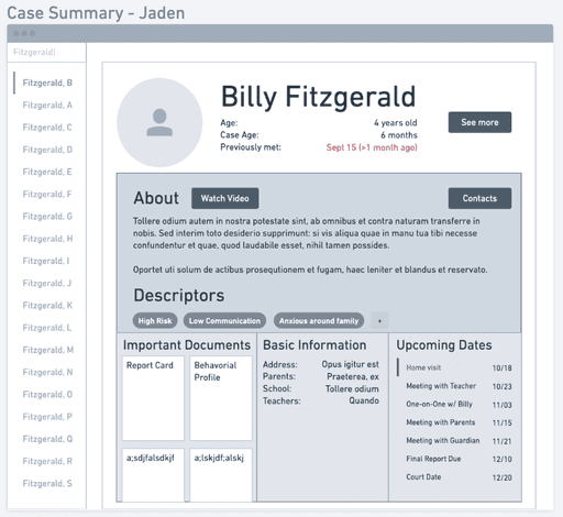
Case Summary
In- app messaging
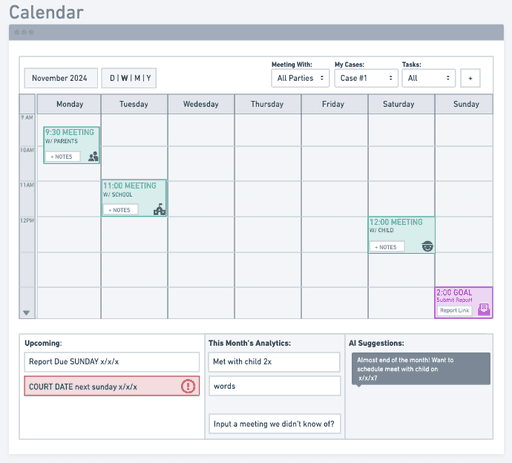
Calendar
[Research]
I began by analyzing 15 competitor sites to see how AI and compliance brands framed their story
Most leaned heavily into technical jargon or overdesigned visuals, which made them feel intimidating. This analysis helped me identify an opportunity for Litewave, to stand out with a tone that felt human, credible, and confident, not robotic or overwhelming.
I documented patterns around layout, information hierarchy, and CTA placement, using them as benchmarks for what to adopt and what to avoid.
[Research]
The users said..
4
CASA volunteers
2
CASA Supervisors
1
Foster care system advisor
[Research]
Based on all the data collected through our research we identified 4 key issues
Time drain
Volunteers spend up to 50% of their time on paperwork, leading to emotional fatigue and less child interaction.
Collaboration Struggles
Coordinating with professionals and families requires frequent, sometimes difficult, communication.
Information Overload
Managing large amounts of data makes it hard to extract key insights quickly.
Emotional disconnect
Volunteers feel their purpose of building relationships with children is overshadowed by admin work.
Legal Anxiety
Fear of missing or misreporting case details adds stress, reducing volunteer confidence.
Fragmented Tools
Volunteers often switch between multiple apps, emails, and printed notes, increasing errors and frustration.
[Analysis]
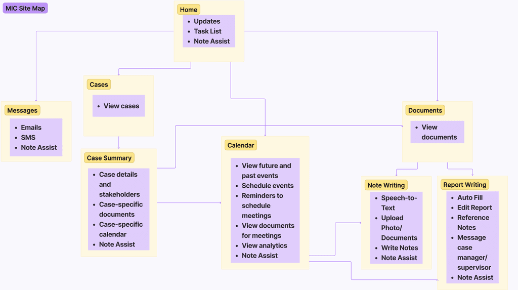
To translate our research into actionable insights, we mapped the entire CorpusKey user flow and created an affinity diagram to categorize pain points, suggested solutions, and small delights.
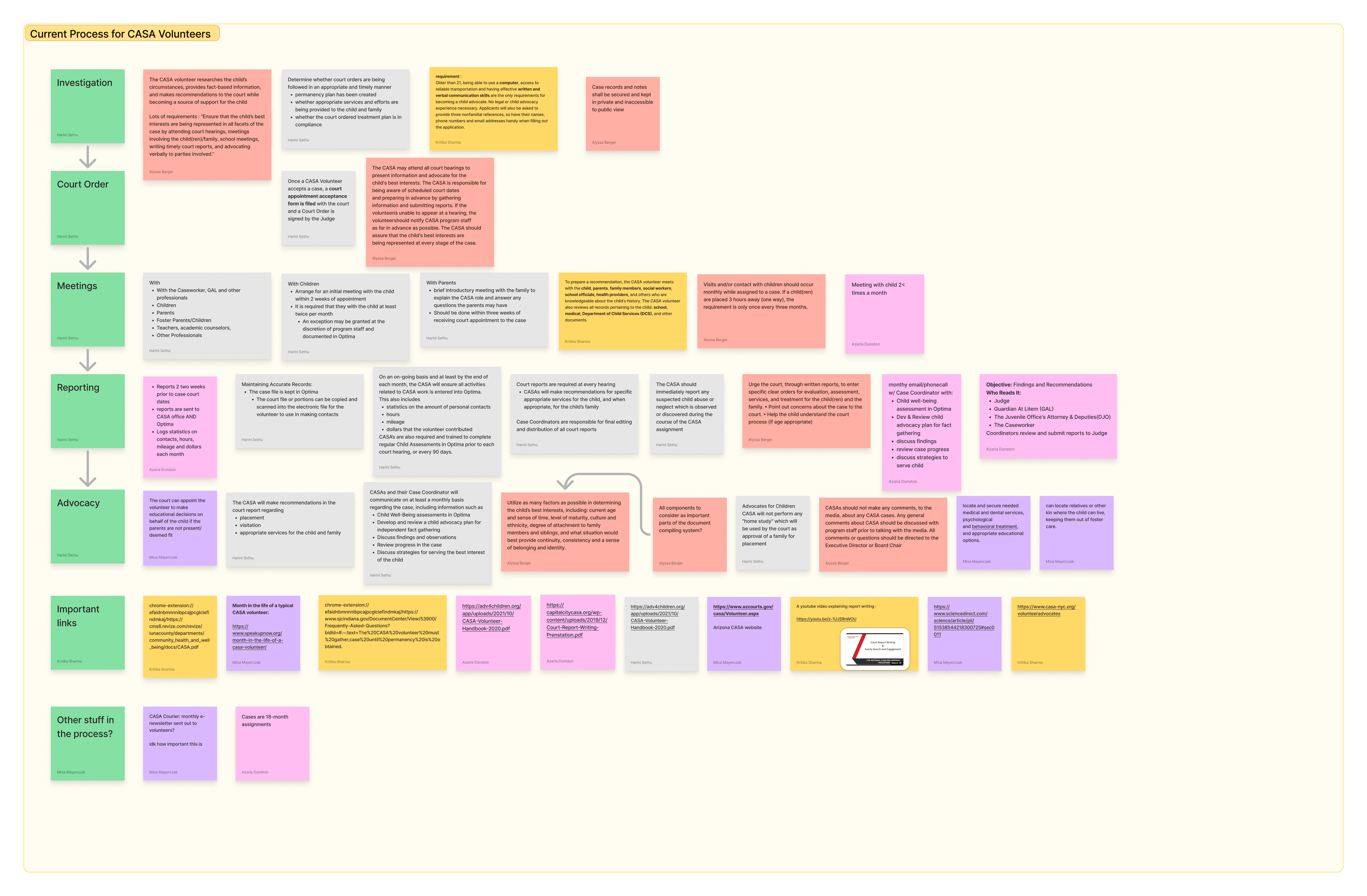
[Analysis]
The site map analysis helped us pinpoint critical friction areas, such as unclear entry points, ambiguous back navigation, and confusing prompt flows. This clarified exactly where instructors felt lost and overwhelmed.
Through affinity mapping, we clustered key pain points around lack of feedback, missing hierarchy, unclear instructions, and trust barriers. These insights directly shaped our design priorities and highlighted opportunities to simplify the platform and empower instructors to work confidently without external help.
[Analysis]
From this synthesis, I derived core design principles to guide solution development
Administrative overload
Volunteers felt “administrative overload” overshadowed their core mission.
Lack of trust in digital tools
There was a lack of trust in digital tools, causing continued reliance on paper notes.
To give emotional support
Volunteers desired more emotional connection and confidence rather than just efficiency.
Simplifying the process
Simplifying compliance was as important as simplifying UI.
[Analysis]
From this synthesis, I derived core design principles to guide solution development
Time over tasks
Prioritize solutions that give time back rather than simply digitize existing workflows.
Confidence through clarity
Ensure volunteers feel secure and guided, especially with legal documentation.
One central source
Minimize tool fragmentation and create one trusted system.
Inclusive by default
Design for accessibility as a baseline, not an afterthought.
[Ideation]
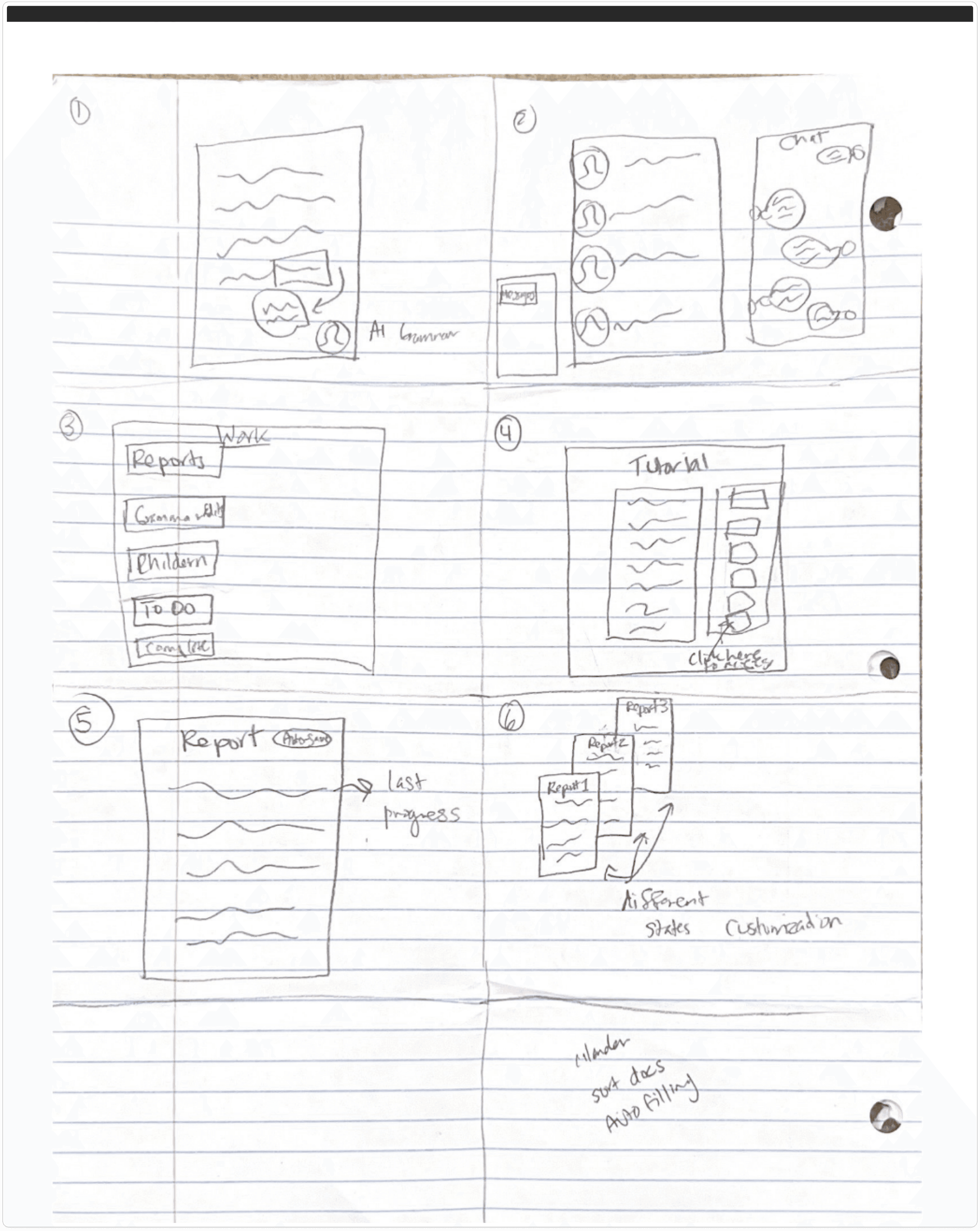
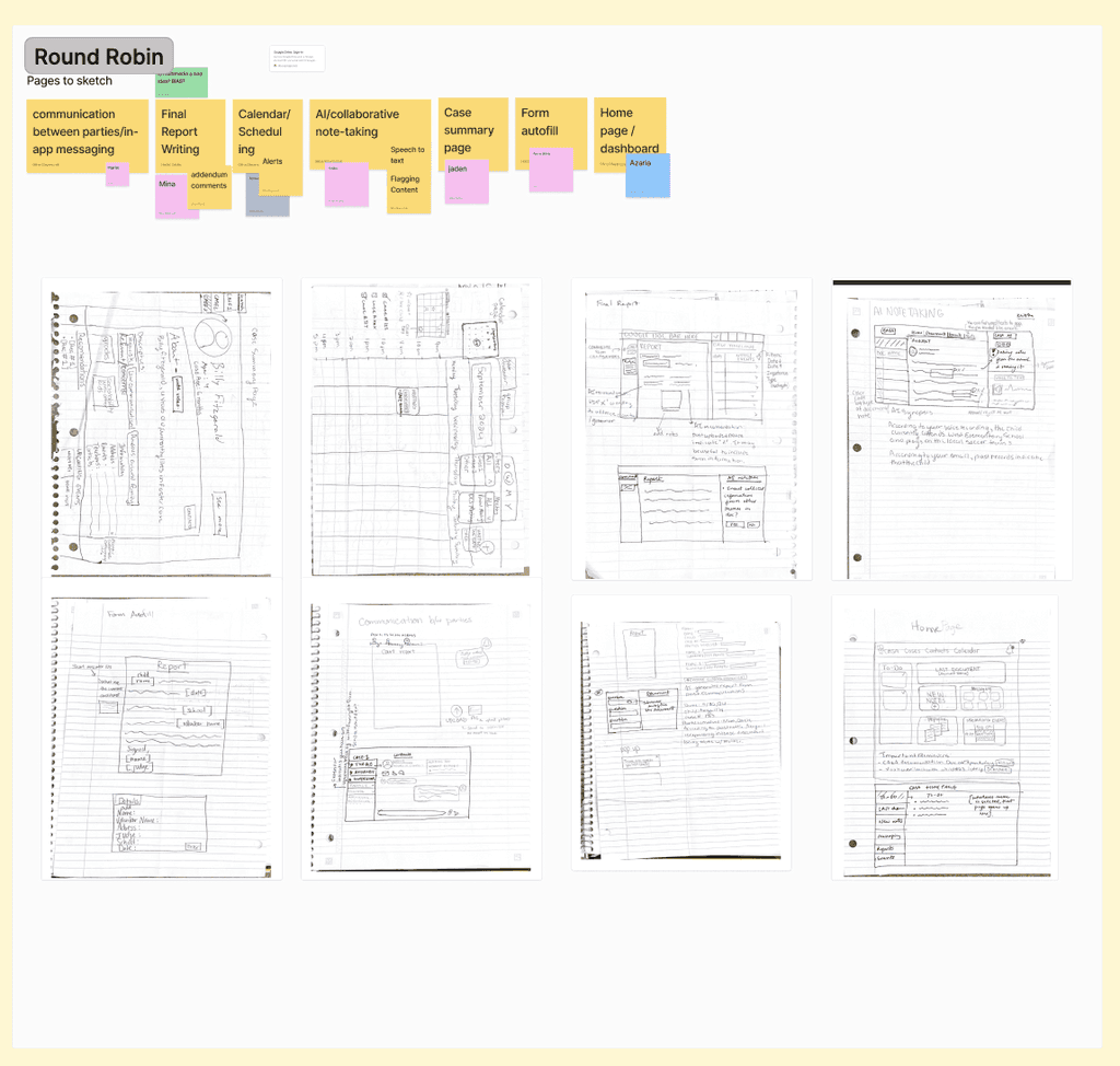
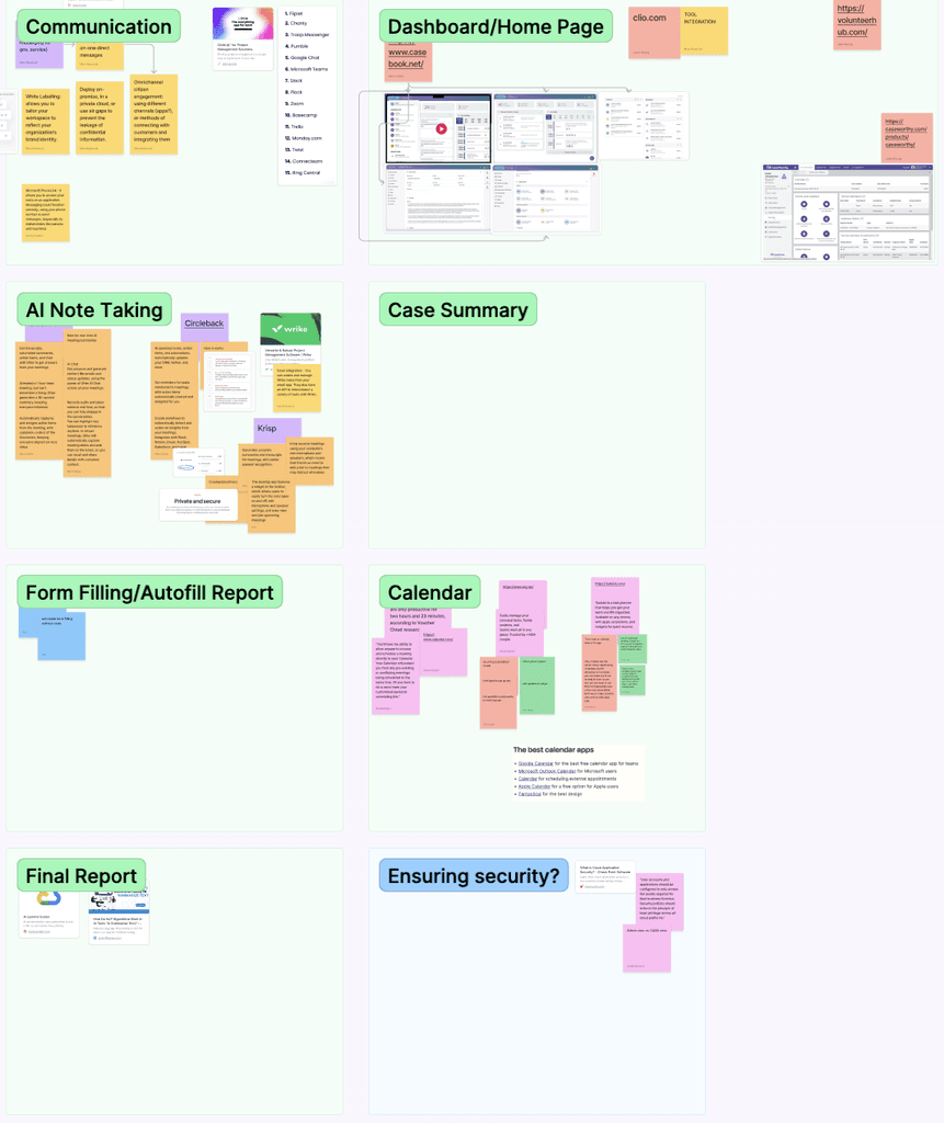
Guided by core design principles, we explored multiple ways to simplify workflows, clarify structure, and build trust in AI-generated content.
We started with low-fidelity sketches and wireframes to quickly test ideas such as nested outline structures, draggable content blocks, and contextual helper text. We also experimented with guided walkthrough flows and progressive onboarding to support independent exploration.
[Ideation]
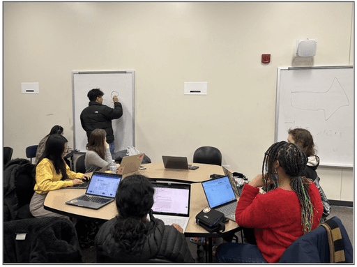
During this phase, we prioritized rapid iteration and early feedback from instructors, allowing us to validate mental models and uncover usability issues before moving to high-fidelity designs.
This approach helped us align our solutions with real instructor needs while keeping the business goals of adoption and retention front and center.
[Ideation]
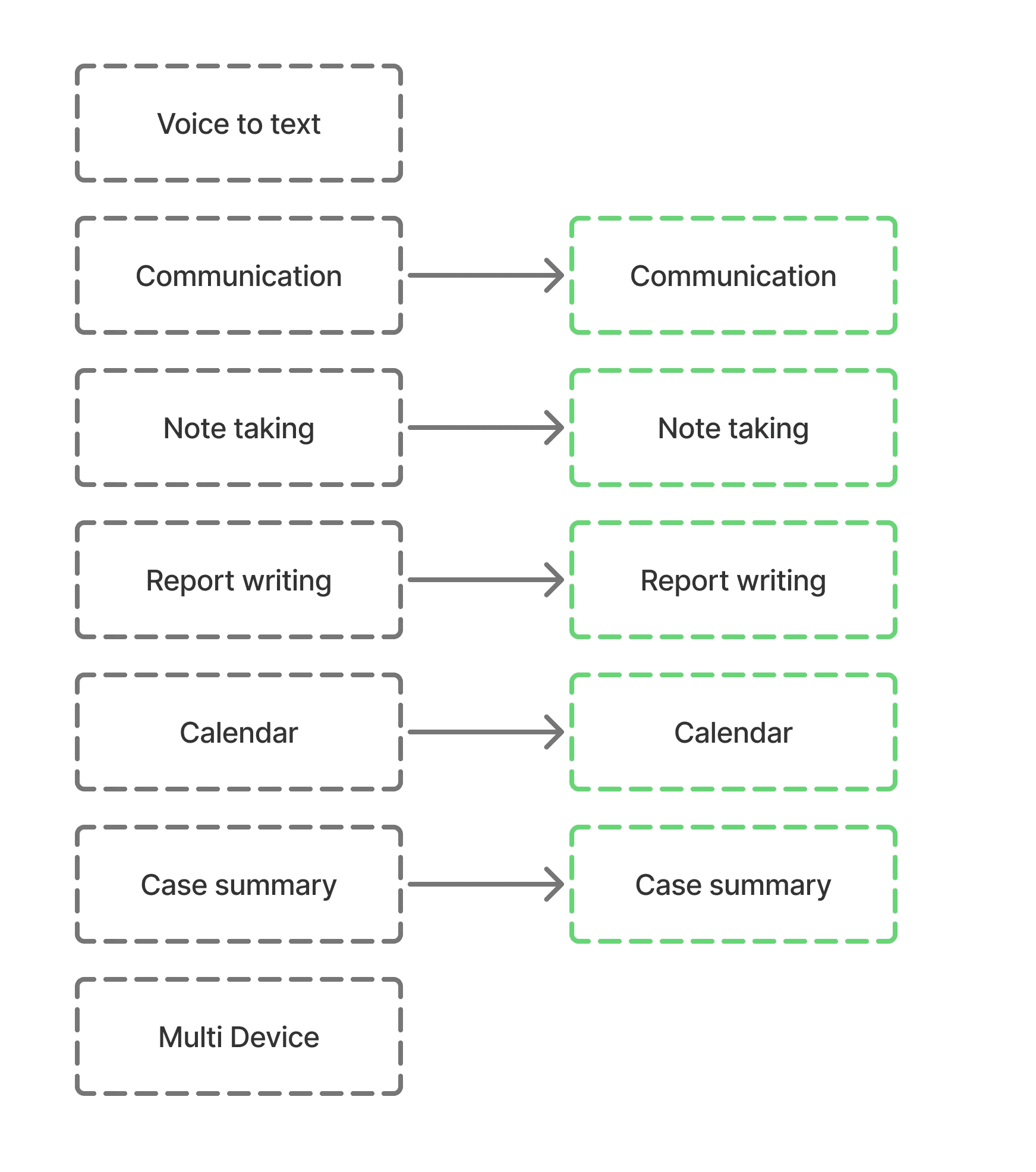
The ideation process revealed that we would focus on the following aspects to improve the overall design
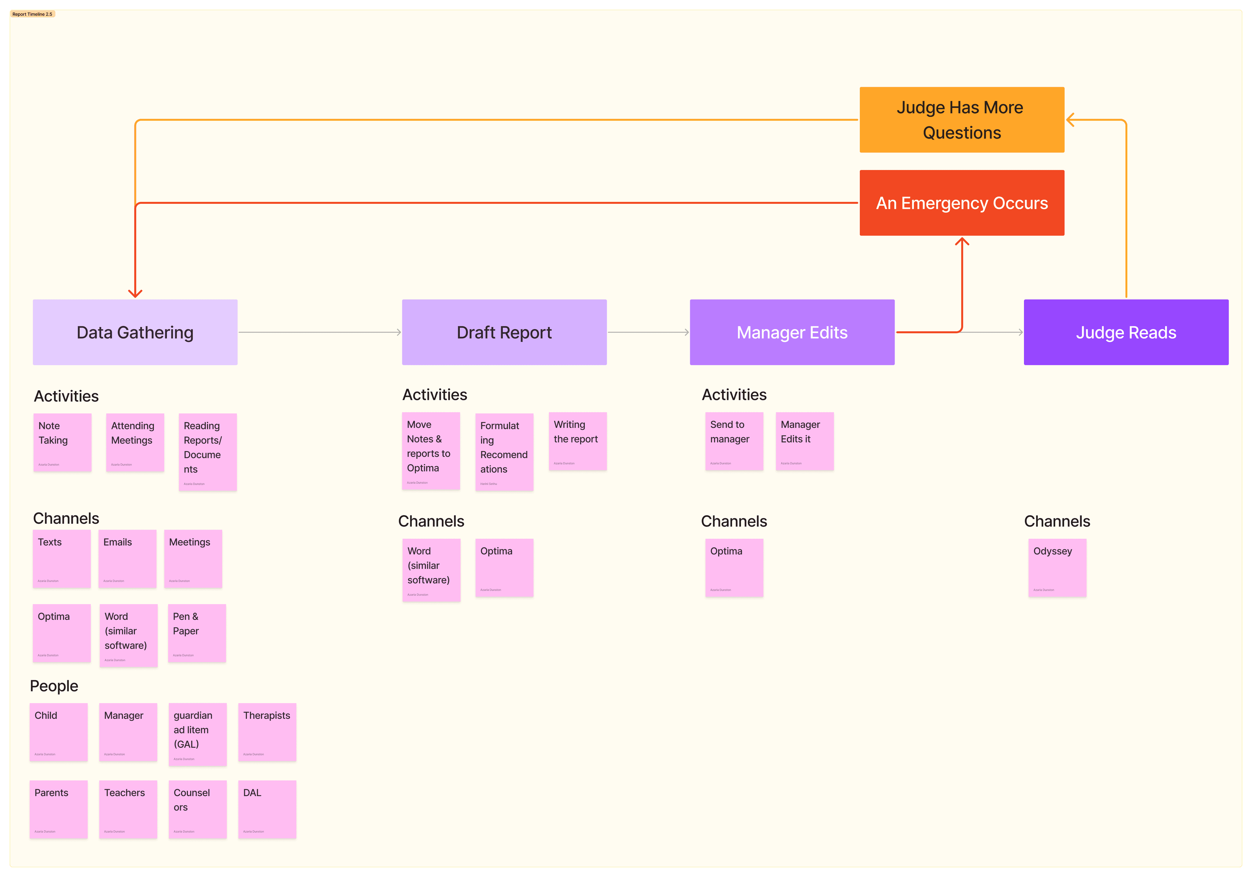
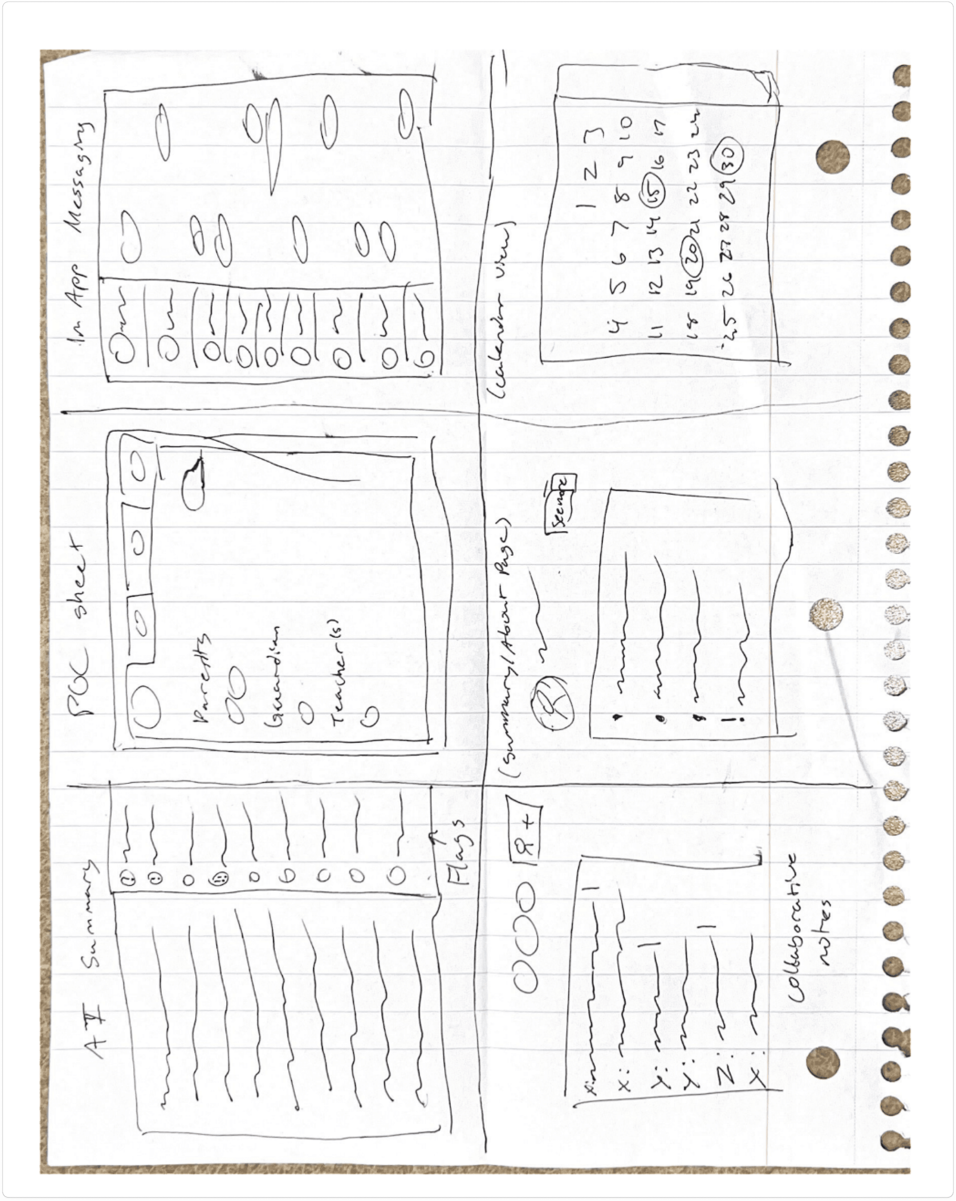
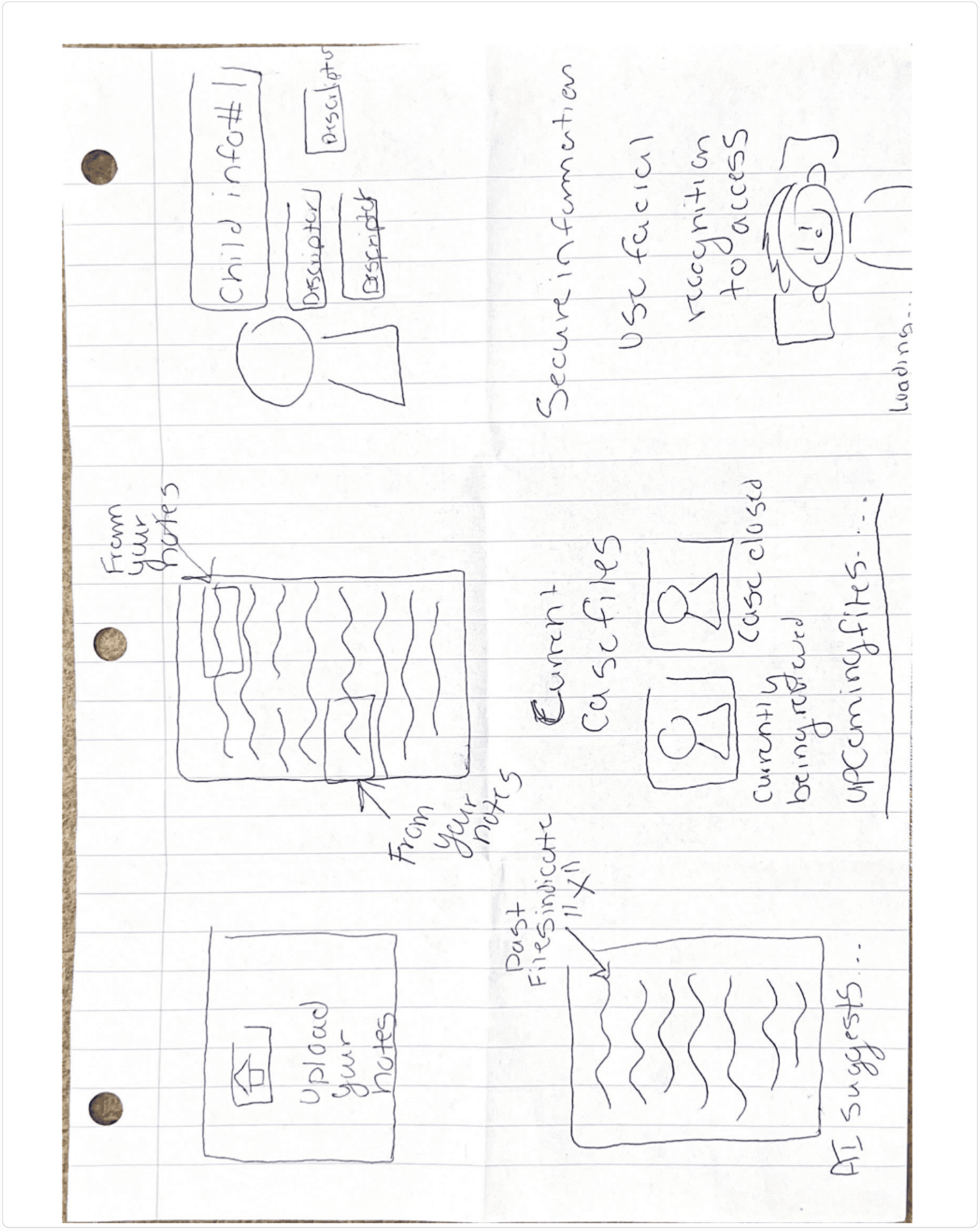
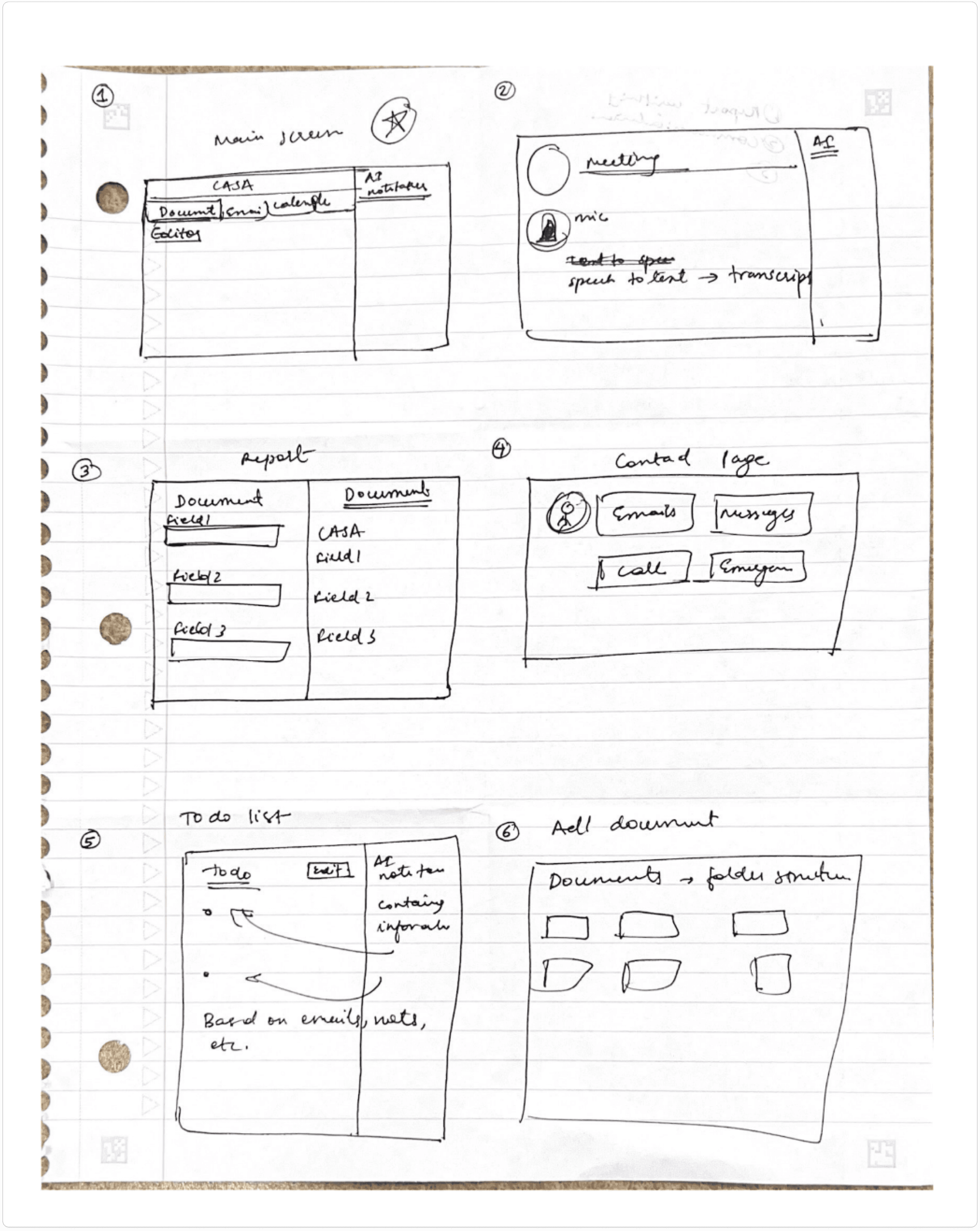
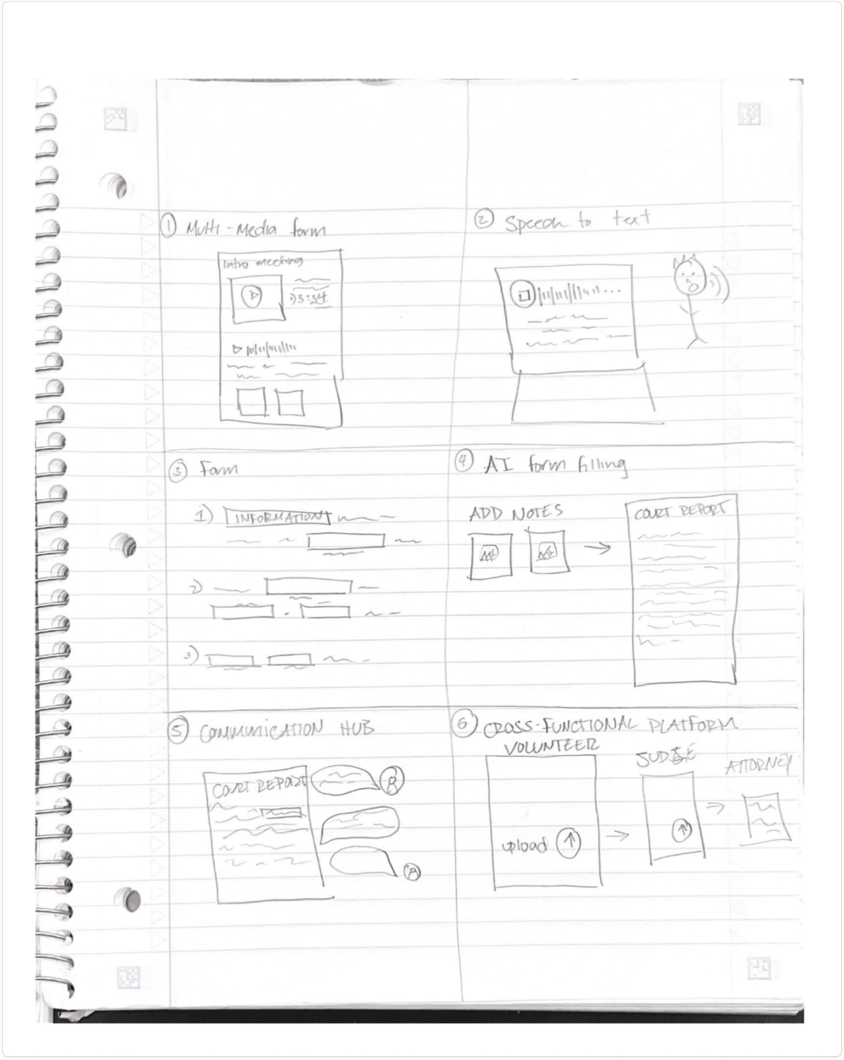
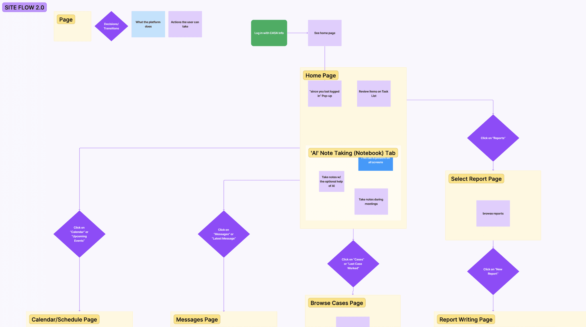
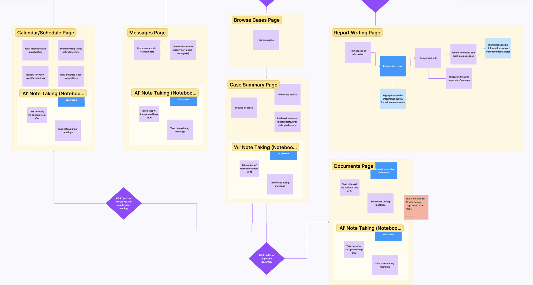
A web-based platform not only allowed us to integrate AI-powered features seamlessly but also ensured ease of access across devices. This decision laid the foundation for the overall information architecture and interaction flows, summarized in the initial site flow and site map below.
[Iterations]
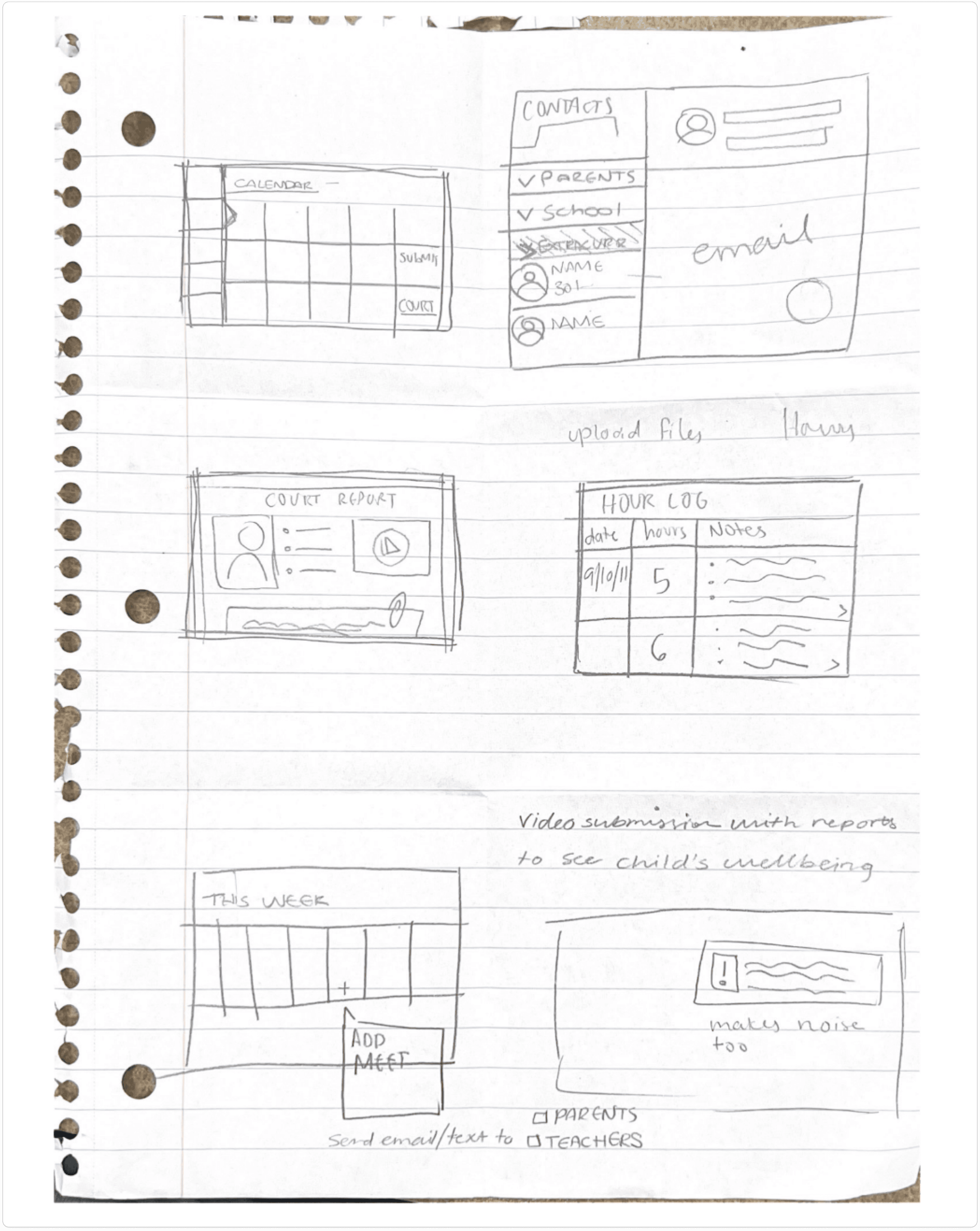
To quickly test information architecture, workflows, and key interaction patterns, we began with low-fidelity wireframes and flow sketches.
These early explorations allowed us to validate fundamental concepts with CASA volunteers and stakeholders before investing in detailed UI design.
[Testing]
I optimized the website for every screen and scenario, from desktops to tablets to mobile devices
Using Framer’s responsive tools, I refined scaling, breakpoints, and component behavior to ensure seamless transitions. Every animation was tested for timing and performance to maintain consistency across devices.
I also performed usability checks with stakeholders to confirm that content hierarchy and navigation felt natural on smaller screens.
Navigation and wayfinding
Some volunteers struggled to understand the sidebar structure and where to find specific case-related reminders and files.
AI note assist trust gaps
Volunteers expressed initial hesitancy in relying fully on AI-generated content, fearing it might miss nuanced child information or legal phrasing.
Onboarding overwhelm
Older volunteers mentioned needing a simplified first walkthrough to feel confident using the system independently.
Reduced cognitive load
Volunteers completed draft reports 40% faster, feeling less overwhelmed by paperwork.
Centralized dashboard clarity
Participants appreciated having all child case details, upcoming tasks, and notes in one place.
Positive emotional response
Volunteers felt less anxious about forgetting important details or making legal mistakes
[Impact]
The site went live in just six weeks, transforming Litewave’s vision into a tangible digital presence
After launch, analytics showed a 42% increase in average session duration and 2× more demo requests in the first three weeks.
The website quickly became the company’s credibility engine, used in investor decks, press communications, and onboarding calls. It was more than a site; it was Litewave’s voice finally speaking clearly.
50%
Reduction in report writing time
AI-assisted drafting and smart templates cut paperwork effort in half, giving volunteers more time with children.
25%
Decrease in volunteer turnover
Streamlined workflows help reduce burnout, improving volunteer retention and long-term engagement.
2x
Increase in child interaction time
Volunteers can double their face-to-face time with children by minimizing administrative load.
[Reflection]
This project reminded me that good design is about translating complexity into confidence
By blending clarity, accessibility, and subtle motion, I built more than a website, I built a foundation of trust.
What started as a design sprint turned into a blueprint for how Litewave communicates its purpose to the world, simple, transparent, and human.